Title, description & layout
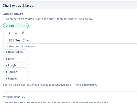
A title, tagline, description, KPIs, an auto-generated insight, and the legend are all placeable pieces. In Chart extras & layout you turn each one on and choose where it sits — top, bottom, left, or right of the chart. Title, tagline, and description text are pre-filled with sensible suggestions you can edit, and support simple Markdown — **bold**, *italic*, and [links](https://…).
Colors
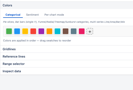
Choose a palette, then pick how it's applied with a per-chart color mode:
- One per category — each bar/slice gets the next palette color.
- Single color — everything in one color.
- By sign — positive vs negative split.
- Threshold bands — color by value bands you define.
- By series — each Y series its own color (multi-series default).
- By value (heat) — shades of one color, darker = larger.
- Colour by a field — on Scatter and Bubble, one color per value of a field (e.g. one per team), with a matching legend.
Wherever colors follow a field, the values sort sensibly by default — ordered ones like Priority and Status read in their natural order (Highest → Lowest, To Do → Done), not alphabetically — or you can drag them into a custom order.
Legend & axes
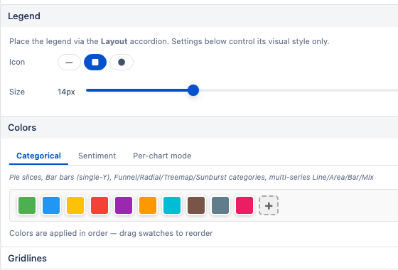
Show or hide the legend, pick its icon shape and size, and set the order its entries appear in — automatically, by size, or by dragging values into a custom order. For axes, toggle each axis on or off and set its label. Sprint charts come with predetermined axis labels (like "Sprint" and "Story points") that you can override. Date axes show the date without the time, and an axis with only a few distinct values (like story points) labels every value.
Reference lines & gridlines
Add horizontal or vertical reference lines to mark targets or thresholds — for example, a line at a goal count. Toggle gridlines for a denser or cleaner look, and on time-based charts enable the range selector so viewers can slice the chart to a sub-range.
Dark mode
There's nothing to set. Pallas Charts follows your Jira theme automatically — when your dashboard is in dark mode, the chart, text, and surrounds switch to match, so it always feels native.
Need Additional Help?
If you have any questions or need assistance, our support team is here to help