Summarize or plot each issue?
Almost every chart starts with one decision: do you want to summarize your issues into groups, or plot each issue on its own? Summarize rolls your issues into buckets and shows a single number per bucket — a count, a total, or an average. Plot each issue draws one mark per issue, positioned by the fields you put on each axis.
For example, summarizing gives you one bar per Status showing how many issues sit in each. Plotting gives you one dot per issue at (created date, story points) — useful for spotting outliers or clusters.
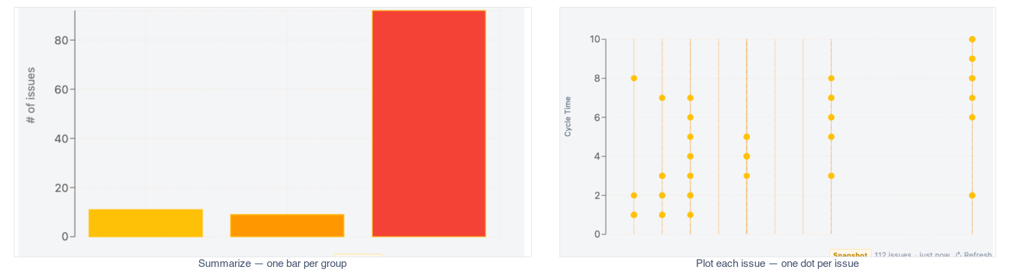
Note: Most reporting charts use Summarize. Reach for Plot when each individual issue matters, such as a cycle-time scatterplot.
How to summarize
When you summarize, you choose how the issues in each group are combined into one number. Count is simply how many issues fall in the group. Total adds up a numeric field, like Story Points. Average takes the mean of that field. Min and Max are available too.
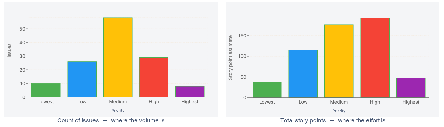
"Count of issues by Priority" tells you where the volume is; "Total story points by Priority" tells you where the effort is. Same chart, very different story.
Break down into series
A breakdown splits each bar or line into segments by a second field — turning one series into several. It's how you go from "issues per status" to "issues per status, split by priority."
Breakdowns read best with a low-cardinality field — roughly 3 to 8 distinct values. A field with dozens of values produces an unreadable jumble of slivers.
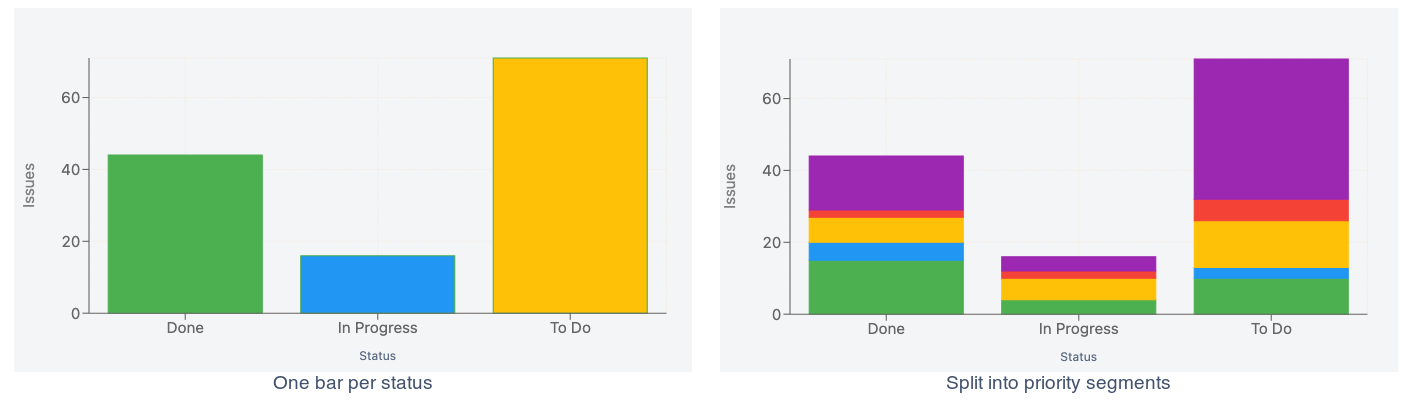
Once a chart has more than one series, you decide whether they stack or sit side by side — see Stacking →.
Stack or side-by-side?
When a chart has more than one series, you choose how they share space. Stacked piles them into a single bar whose height is the total. None (side-by-side) places them next to each other so you can compare each series directly. 100% normalizes every bar to full height, showing each series' share of the total.
Stacked → total issues per status, split by priority. Side-by-side → priorities compared within each status. 100% → the priority mix in each status, regardless of overall volume.

Group dates by period
When your axis is a date, charting every individual timestamp produces one point per moment in time. Grouping by period — Day, Week, Month, Quarter, or Year — buckets those dates so each bucket becomes a single point.
"Created date grouped by Month" gives you twelve clean points across a year instead of hundreds of scattered ones.
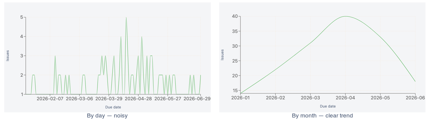
Note: Buckets are timezone-stable and always ordered chronologically, so the axis reads left-to-right in time order.
Need Additional Help?
If you have any questions or need assistance, our support team is here to help