Overview
Pallas Charts offers more than twenty chart types, from everyday bars and lines to agile sprint reports. You don't have to know which one you want up front — the gadget suggests good matches for your fields, and switching type keeps your data in place.
The sections below group the types by what they're best at. How a chart turns issues into shapes (summarizing, breaking down, stacking) is covered in Understanding your data →.
Bar, line & area
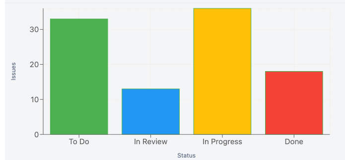
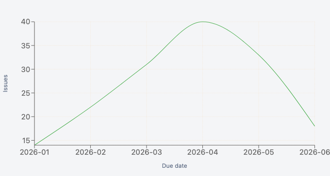
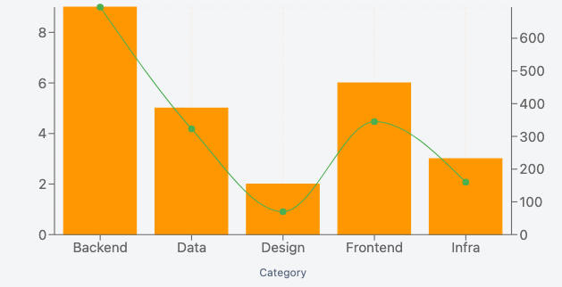
The workhorses. Bar compares a value across categories; Line and Area show how a value moves over time. All three support breakdowns into series, stacking, multiple Y metrics, and a second (right-hand) Y axis.
Need more than one mark type on the same chart? Mix combines bars, lines, and areas — for example, bars for issue counts with a line for a rolling average on top.
Proportions: pie & funnel
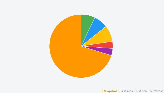
Pie shows each category's share of a whole — best with a handful of slices. Funnel shows how a count falls away across ordered stages, useful for workflow drop-off (e.g. issues by status from To Do to Done).
Hierarchies: treemap & sunburst
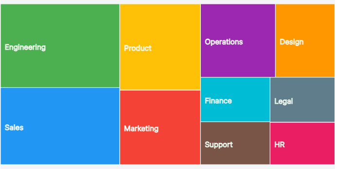
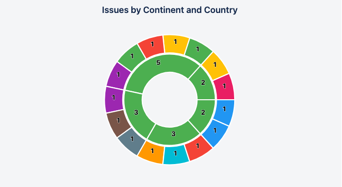
When categories nest — say issue type within project — a Treemap sizes rectangles by value, and a Sunburst shows the same as concentric rings. Start with a primary category and a breakdown, then nest deeper — up to four levels — for a ragged multi-ring hierarchy where some branches run deeper than others. A long tail rolls into an "Other" group so the picture stays legible.
Distributions & relationships
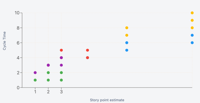
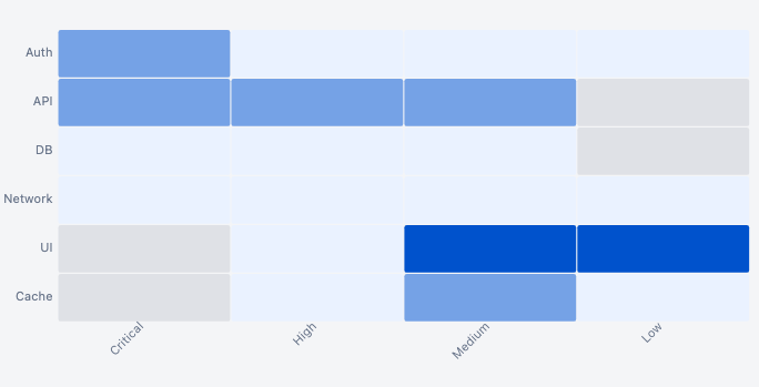
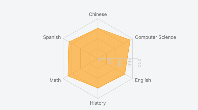
Scatter plots one dot per issue at (x, y) — ideal for spotting outliers and correlations. Bubble adds a third dimension as dot size. Both can colour each point by a category — one colour per team, say — with a matching legend. Heatmap shows a value across two categorical dimensions as a shaded grid, revealing hotspots at a glance. Radar compares several measures on one shape.
Single value: KPI & gauge
Sometimes one number is the story. KPI shows a single headline figure (a count, total, or average) with an optional label. Gauge and Radial bar show progress toward a target as a dial or ring — and a Gauge can split its track into coloured zones (green / amber / red) so a value reads as good, warning, or critical at a glance.
Timelines: Gantt
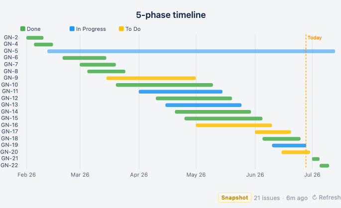
Gantt draws one bar per issue from a start date to an end date, optionally colored by a field — a quick roadmap or schedule view straight from your issues' date fields.
Sprint & agile charts
A distinct family driven by a board and its sprints rather than a JQL query. Pick a board, the sprints to include, and a story-points field; the data comes from Jira's Agile API.
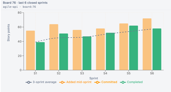
- Velocity — committed vs completed points per sprint.
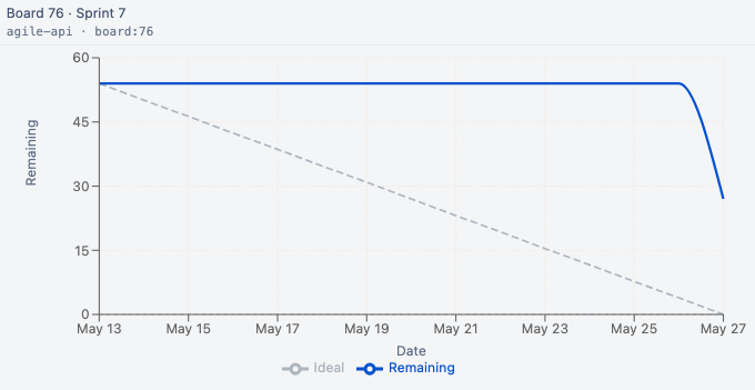
- Burndown — remaining work across the days of a sprint.
- Burnup — completed vs total scope, so scope growth is visible.
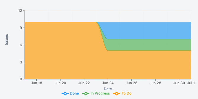
- Cumulative Flow — issue counts by status over time.
- Throughput — items completed per sprint, with a rolling average.
- Cycle Time — days from start to done, per completed issue, with percentile lines.
- Forecast — a Monte Carlo projection of how much you'll likely finish next.
Every sprint chart also reads itself: a plain-English insight line sits beneath it — “Reliable delivery — completing about what's committed”, “Velocity is trending up”, “Behind the ideal — 30 pts still open” — so viewers see the pattern without having to interpret the chart. It refreshes with the data, so a chart a lead builds keeps narrating itself for the whole team.
Need Additional Help?
If you have any questions or need assistance, our support team is here to help